The idea of having the coolest PowerPoint slides in the office is getting trendier by the year, which I think is great. People are finally acknowledging that SmartArt and bullet points just won’t do it anymore. It makes sense too; as the years go by, we witness more and more stunning presentations at our meetings, conferences and other events, and we continuously look for ways to incorporate the beautiful stuff we see into our work.
There’s still a problem, though: nobody knows how to design slides that are made to impress.
Slide Cow: Creating Cool PowerPoint Slides Since Inception
A while ago, I started a video series called Design a Good Slide. The premise was simple. I asked day-to-day presenters to email me their dull, boring slides (no offense, everyone) so that I can base a tutorial on beautifying them. It’s sort of like your local home makeover TV show, except with PowerPoint.
There was only one caveat: I never sent the redesigned slide back to the original sender. I’m a believer that knowledge is meant to be shared and practiced, and that the only way to get people to understand something is to make them do it.
Although the first season of the series has ended, it still would be worth your while to watch how every-day slides that you’re used to can be transformed into something truly epic. I even made sure that these tutorials are straightforward. This means that anybody, even those that are new to PowerPoint, can recreate the results that they see.
So, without further ado, here are nine cool PowerPoint slides that you can make from scratch right now. If all you’re after is sneak peaks, then you can see the original slides on the left and Slide Cow’s redesigned slides on the right.
The Wedding Planner’s Social Media Slide
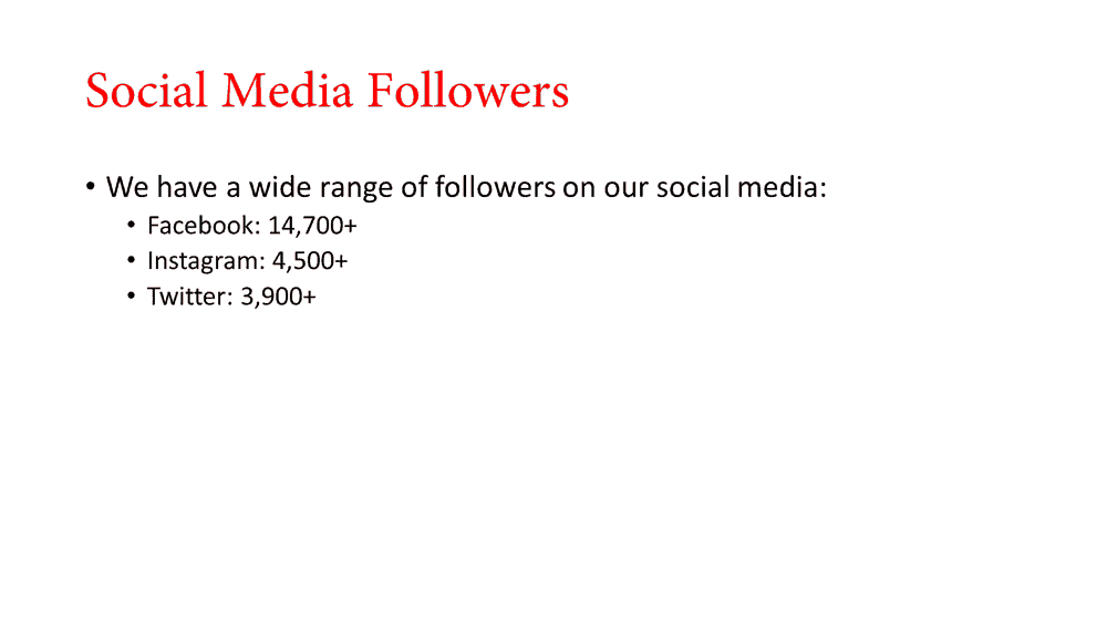
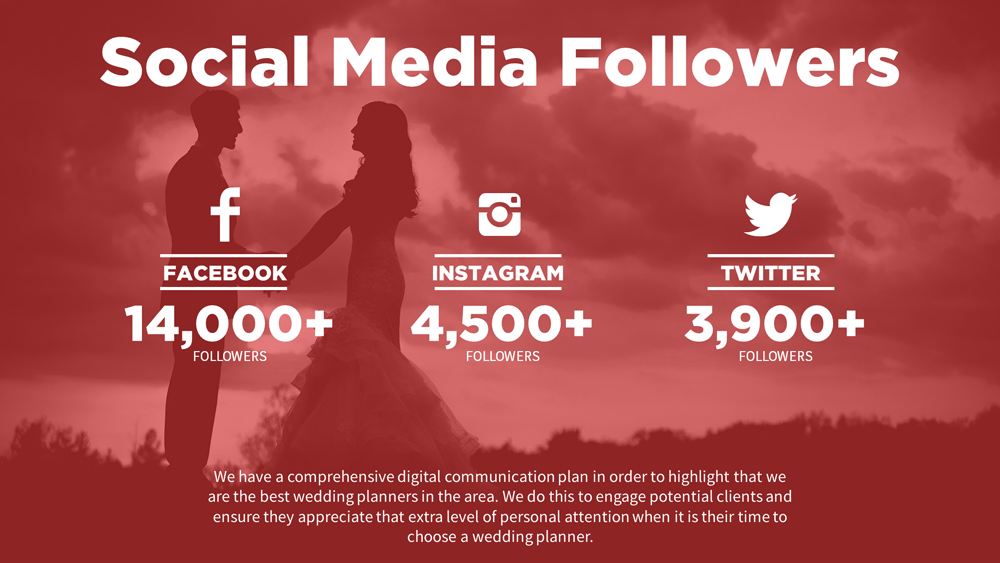
Jen wanted a way to illustrate the different likes and followers that her wedding planning company attains on various social media platforms. She went for a bullet-point format because of course she would. Everyone does it anyway, right?
I wanted something different, so I tried to create something that doesn’t only express her message, but her company’s too. Her slide went from boring to awesome in no time.
Learn how to make this dazzling social media slide by clicking here.
The Quote Slide (ft. Steve Jobs)
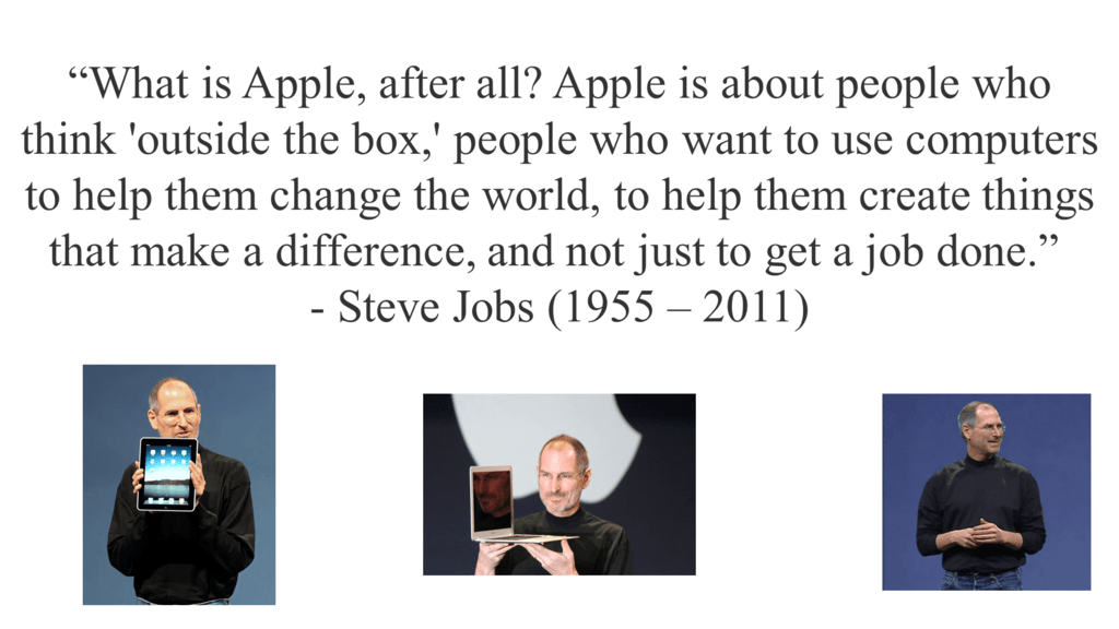
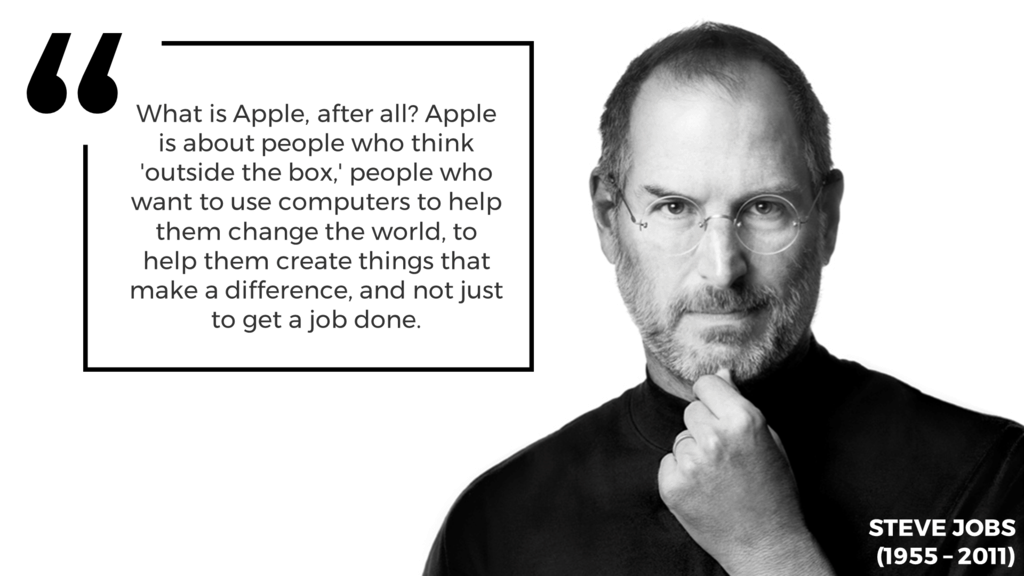
Sandeep was tasked with presenting Steve Job’s biography to his classmates. He wanted a fancy way to illustrate one of the late tech mogul’s quotes. The slide he sent me is pretty much what you’d expect: images of Steve Jobs left, right and center with a quote plastered in the middle.
I opted for something more minimal while upholding layers of emotion. I wanted the slide to speak to the audience, and I think I achieved that. You can too.
Learn how to feature a sleek quote on your slide by clicking here.
The Emoji Bar Chart Slide
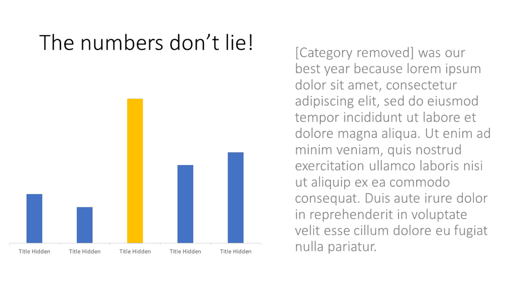
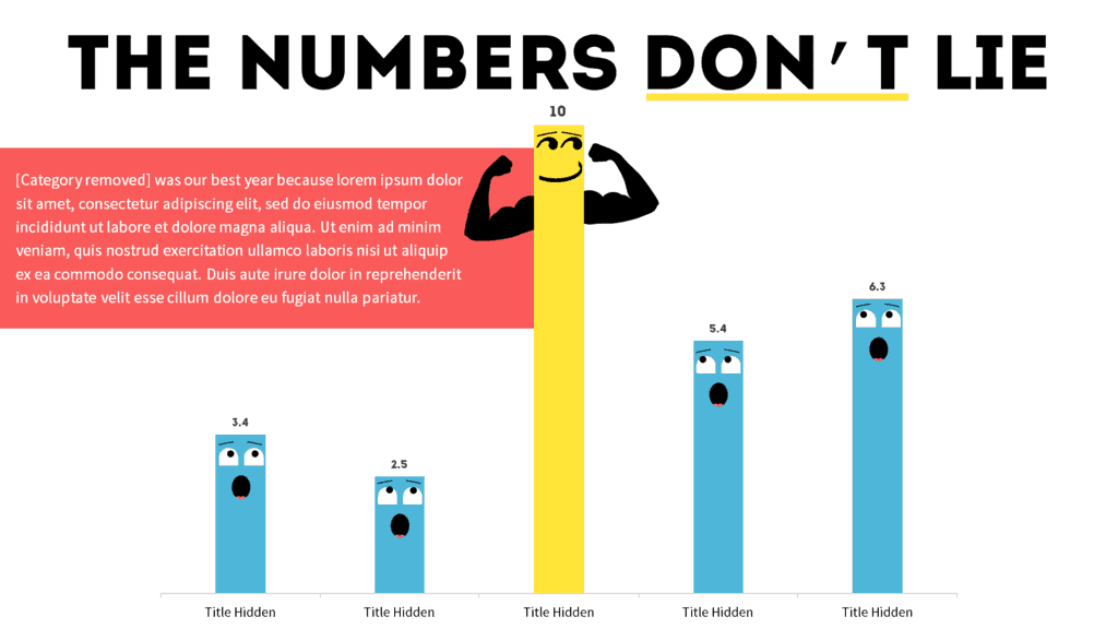
John had a slide featuring a bar chart. He claims that it was “boring.” He asked for help to make his slide look more “creative” and fun.”
Fun’s my middle name.
I added life to his bar chart by throwing in a few icons and playing with a few shapes, all while staying consistent with John’s original theme. Sure, the thought of your bar charts growing eyes and arms is terrifying, but I made sure to make this tutorial as adorable as possible. Cool PowerPoint slide overall, don’t you think?
Learn how to bring life to your bar charts by clicking here.
The ‘Keys To Success’ Slide
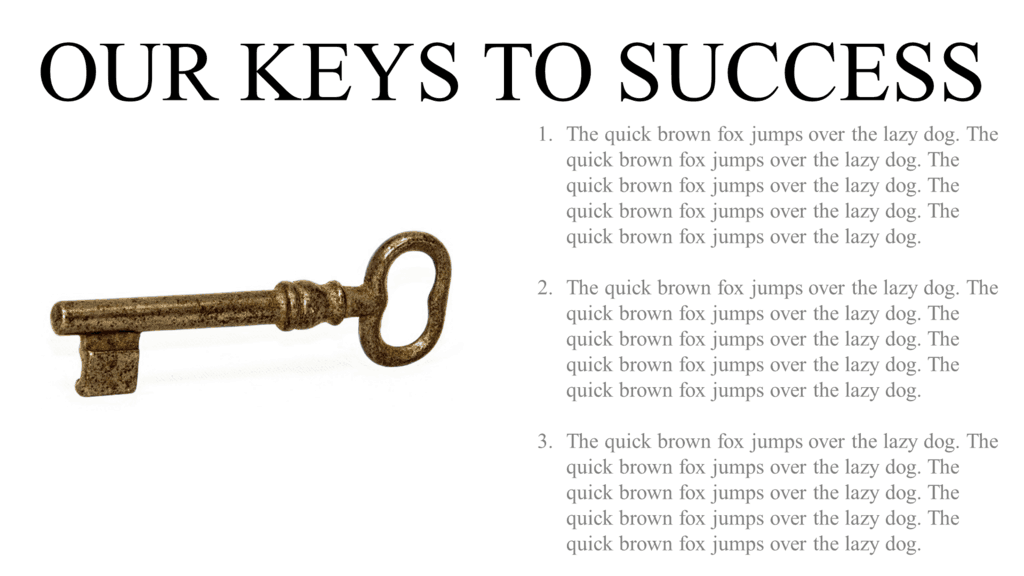

Ben wanted to base his PowerPoint slide on the idea of success connecting to specific attributes. In layman’s terms, he needed his picture of a key to talk to the text, and vice versa.
I don’t like using generic images of things to highlight important messages, so I opted for making an infographic of a key instead. I didn’t do anything fancy, either. All I used were a few shapes and some built-in PowerPoint features. Result: a cool PowerPoint slide where everything talks to each other.
Learn how to design a key infographic (from scratch) by clicking here.
The Valuable Star Slide
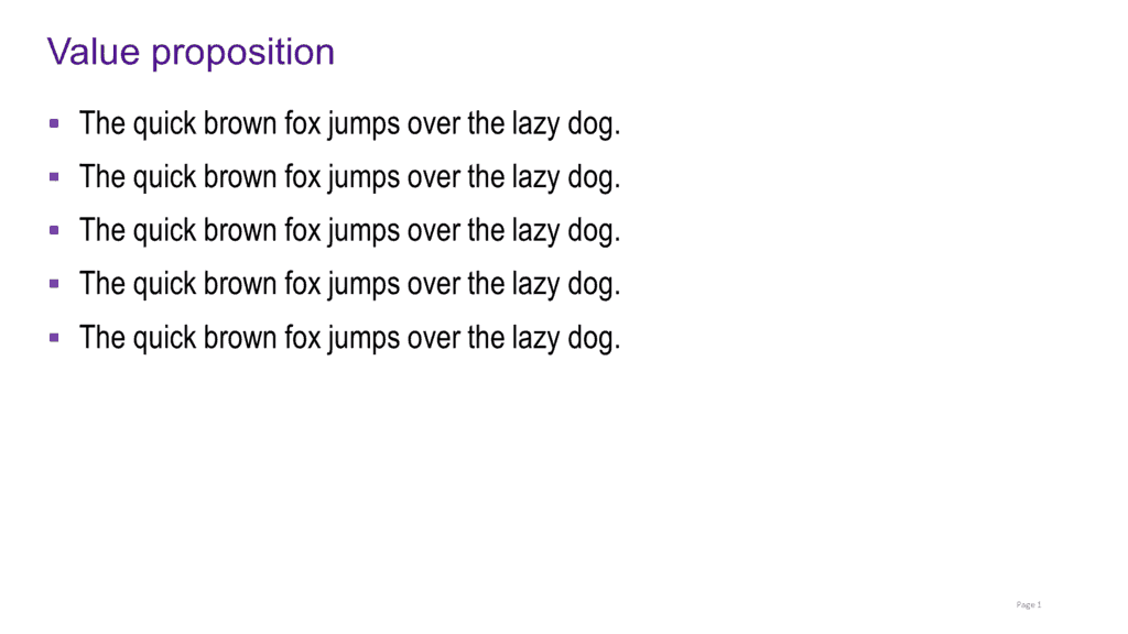
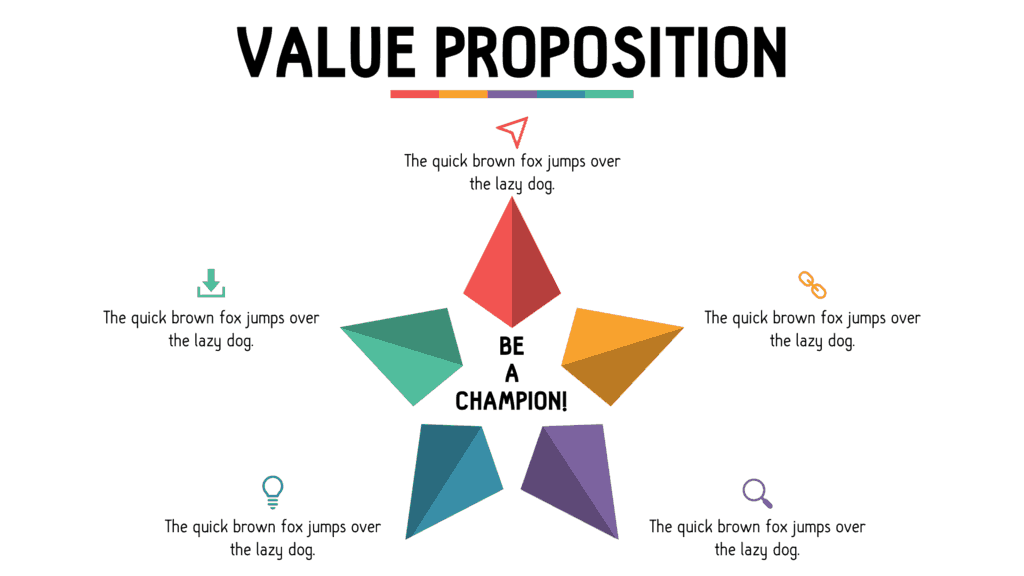
Tiffany sought to express a list of points as being valuable. She went for the infamous bullet-point method because she had trouble finding the right way to design her slide.
I’ll admit, it took me a while to find the best way to express her message. I ended up going for a star infographic. I mean, stars are valuable … right?
Learn how to create a star infographic in PowerPoint by clicking here.
The Vertical Agenda Slide
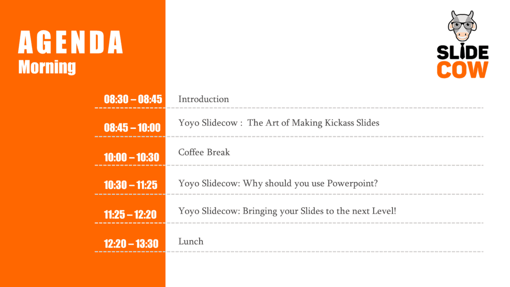

Melanie designed an agenda slide that, at least in my eyes, was pretty damn good. She even themed it to Slide Cow’s brand colors! She was looking for a “wow-effect” to take her design skills to the next level, though.
This tutorial was one of the most challenging ones I’ve ever published. I didn’t want to drift too far away from the original concept. The only things I could think of was restructuing the content and adding a few icons. Sometimes simple approaches can lead to a cool PowerPoint slide, too!
Learn how to make an awesome agenda slide by clicking here.
The Happy and Creative Front Cover Slide


Stacy wanted a front cover that was simple and effective. She got the simple part right, but the effectiveness could have been worked on a little more.
I stayed true to Stacy’s message by adding a different picture and playing around with different fonts, shapes and colors until I hit the right note. The biggest challenge was making sure everything was working together, which I think I achieved.
Learn how to bring joy to your front cover slides by clicking here.
The Rotating Medical Heart Slide
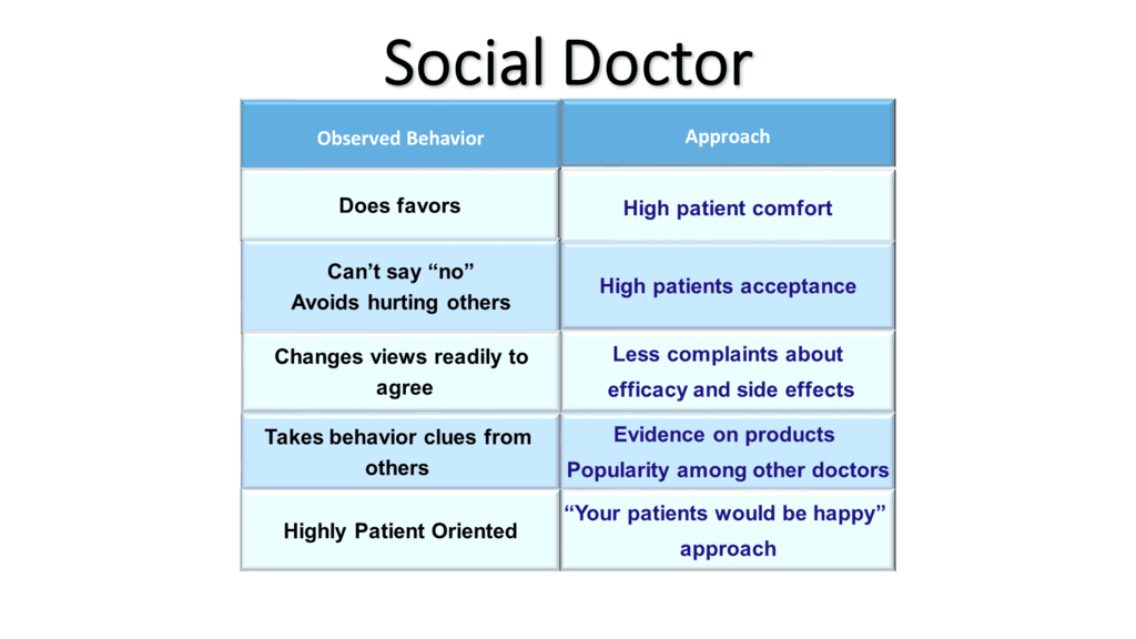

This one was the toughest of them all.
Sanjay had a medically-themed PowerPoint slide that needed some serious rework. Since his topic is quite niche, it took me days to find something that would work for him. I almost gave up.
I finally opted to go for a heart being the centerpiece of the slide. To seal the deal, I designed a heartbeat in the heart itself, rotated it, and made his points come out from either side. The end result looks fantastic, and I think you can achieve something similar.
The Tinder PowerPoint Template
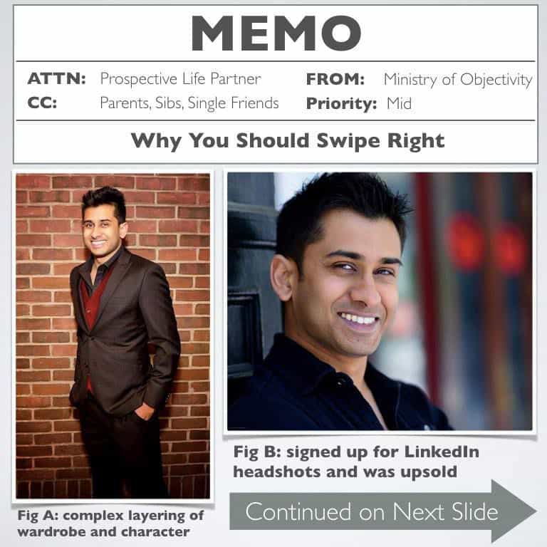

Oh boy, the story behind this tutorial is EPIC.
Niket Biswas was looking for a way to stand out from the hundreds of thousands of guys on Tinder. Yes, I’m referring to the dating app. Want to have a guess at what he did?
He turned his Tinder Profile into an epic PowerPoint pitch.
I reached out to Niket and asked if I could redesign his slides and feature him on a Slide Cow tutorial. He graciously agreed, and thus, the Tinder PowerPoint tinder template was born!
Learn how to use PowerPoint to get more matches on Tinder by clicking here.
Learned Enough? Now Get To Work
If you want to learn how to create cool PowerPoint slides, then you’re going to have to keep your head down and work your butt off. This sort of thing takes a lot of time because you have to find a way to balance your requirements with your sense of design, all while translating a message into something visually expressive. It took me years to get here, and I still have a long way to go to get to where I want to be.
My advice would be to watch these tutorials, take note of the various principles, learn from them, and keep practicing. You’ll end up creating mouth-watering pieces in no time.
A nice collection of before and after slides you have put up to illustrate how one can “really” improve a dead ppt set. Thanks a lot for the demo!!!