Looking for a creative way to present an important statistic?
Look no further.
In this tutorial, I’m going to show you how to design a slide so beautiful that it gives your statistic justice. You won’t even need to use Photoshop, Excel, or any of that stuff; all you need is PowerPoint, an image of your choice, and a dash of creativity.
The end result will look something like this.

1. Find a PNG Image To Use
Before designing anything, your first job is to find a picture that can be used to present your key statistic.
The goal is to find an image in a Portable Network Graphic (PNG) format. PNGs are one of the few image types available that can handle transparency. Transparency, in this context at least, refers to the lack of a background. If you’re interested, SitePoint has fantastic write up on different image file types that you can check out.
One more thing: don’t go for just any image. Choose a high-quality photo that follows the BARE principle.
Once you found what you’re after, bring it into your slide canvas, and position it wherever you’d like.

2. Turn Your Image into a Bar Chart
Select your slide and duplicate it by pressing Ctrl + D. You should now have two identical slides that you can play around with.
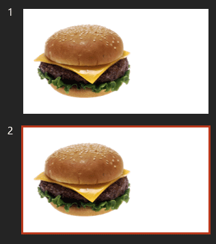
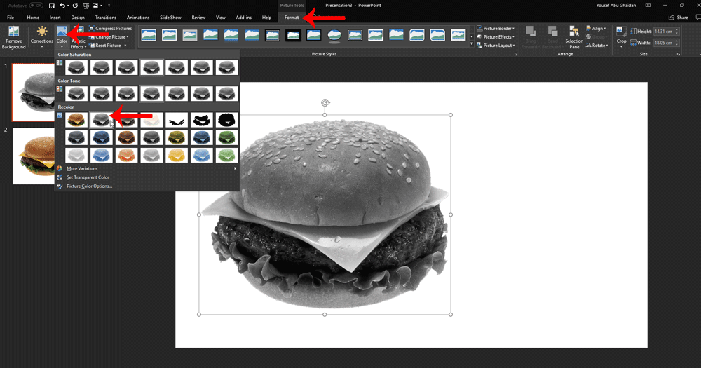
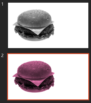
Go to your first slide, click on the image, and then go to Format Tab. Click on Color and choose the Grayscale option.
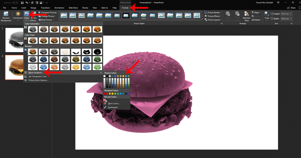
Now go to your second slide. This time you’re going to pick a color overlay. To do this, click on your image and go to Format > Color > More Variations. Choose whatever color you’d like.
You should have two slides with different color patterns, like so:
Now click on the image on your second slide (the colored one). Click Crop in the Format Tab.
This is where things get interesting. Crop the image to reflect your statistic. If, for example, your statistic highlights 30% of something, then crop the image until you have 30% of it left.
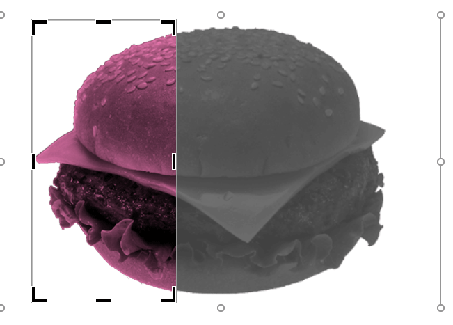
Don’t bother being precise. Nobody is going to take out a ruler and start measuring whatever is on your slide. Just go for something indicative.
Now, press Ctrl + C to copy your cropped image. Head to your first slide (the one with the grayscaled image), and press Ctrl + V to paste it.

Voila, you just created a creative bar chart using images. You can now delete your second slide and move on.
3. Express Your Statistic With Text
So you’re done with the illustrative part. Awesome. Now, type out your statistic to reflect the illustration you made.
Don’t be afraid to be creative in this step. Use a combination of different fonts, font sizes, shapes and colors to really bring out your message.
A Creative Solution That Works Perfectly
See how powerful PowerPoint is? A lot of users don’t even know they can do something like this, let alone do it easily.
By going through these three easy steps, you too can create a slide that expresses key statistics in an intuitive way.
Now it’s your turn; go ahead and create a slide similar to the one in this tutorial.
If you run into any problems, or just want to show me what you’ve made, then just drop a line in the comments section.

Awesome! I loved that!
Thanks Toqeer!
Very cool!! Thanks so much for sharing !
very creative.. thank you !!
You’re welcome!
Thanks a bunch! <3