How to Make a Cool-Looking Gear Infographic on PowerPoint
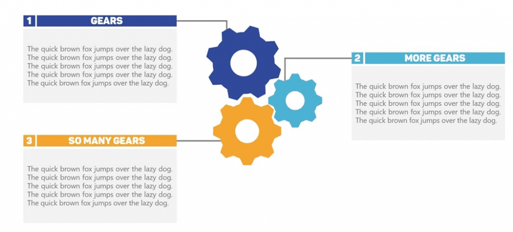
Good morning, afternoon, or evening, depending where you are, to all my fellow PowerPoint enthusiasts. This week’s tutorial is actually going to be super easy, but super effective. I’m going to teach you how to make a gear infographic on PowerPoint! Sometimes, the best PowerPoint slides are also the simplest. This slide in particular uses […]
Good Slide Design: How to Pick The Perfect Colors in PowerPoint
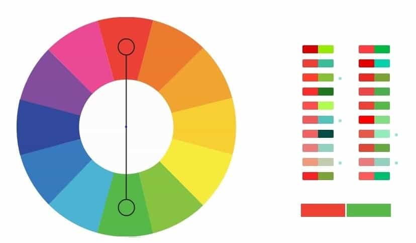
When it comes to effective slide design, picking the right colors will always go a long way. Let’s face it, good slide design isn’t just about making stellar infographics, it’s about making everything ‘fit’ with each other. We have to pick the right colors to make our slides beautiful, and that’s why we made this […]
Here’s A Cool Way to Display Survey Results in PowerPoint
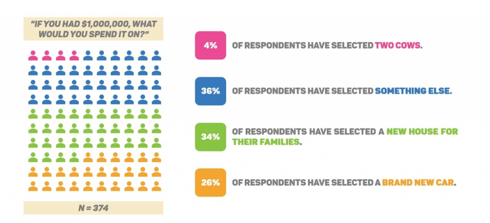
You just conducted a survey. You worked hard on your research. You gathered all these fancy numbers and statistics. You even made an epic analysis that’s about to get you promoted. Now, you’re thinking about presenting that information in a way that’s meaningful. There’s only one problem. You have no idea how to do it. […]
Make Your Own KPI Dashboard Infographic on PowerPoint

So, this week, I thought it would be fun to teach you PowerPoint junkies exactly how to make your very own KPI Dashboard that will make your data look awesome. I use this one innovative trick that not many people do, and I used it specifically to teach you guys what you all could do […]
How to Make Your Pie Chart Look Awesome on PowerPoint
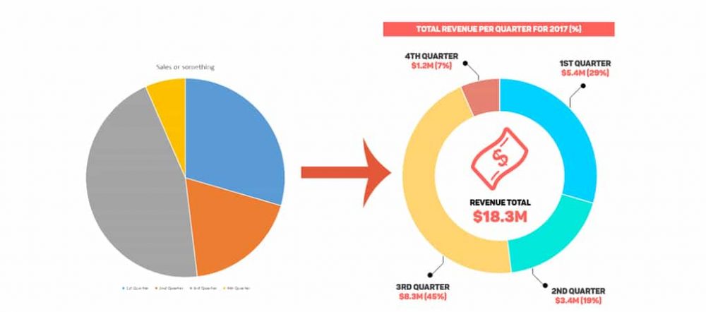
Welcome to another chapter in our PowerPoint tutorial series. Last week, we covered how you all can up your bar game by making your bar charts look awesome in PowerPoint. Following that trend, this week, we’re going to dedicate our time to the infamous pie chart. We All Hate Bland Tasting Pies, So Don’t Create A Bland […]
How to Make Your Bar Chart Look Awesome on PowerPoint
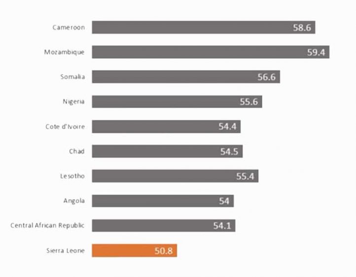
Greetings PowerPoint professionals! This week’s topic will be concerning bar charts (also known as bar graphs). You’ve seen far too many of these on various PowerPoint slides, and very few look great. Don’t worry though; Slide Cow is here to fix that. I’m Assuming You Know What a Bar Chart Is … Right? I won’t […]