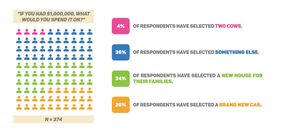
You just conducted a survey. You worked hard on your research. You gathered all these fancy numbers and statistics. You even made an epic analysis that’s about to get you promoted. Now, you’re thinking about presenting that information in a way that’s meaningful.
There’s only one problem. You have no idea how to do it.
Until now.
Don’t worry, you got this. Because I’m going to show you exactly how you’re going to communicate your survey results through a fancy-schmancy infographic.
An Infographic? For Survey Results? Really?
Yes, really.
I know it sounds difficult and time-consuming. But seriously, don’t worry. Infographics are great because they can be as simple or as complex as you want them to be. In fact, the PowerPoint tutorial for this segment is just under 15 minutes. Oh, and here’s a bonus: you’ll have a slide you can use for all the survey results you want to communicate in the future.
But… an Infographic?!
Okay, look. I tried being nice. Now I’m going to get all formal and teachy.
When we design something on a PowerPoint slide, we have to look for ways to package the information that we want communicate. Packaging information is basically taking what we have and turning it into information that an audience wants to understand and process. An infographic helps a lot here because we’re allowing members of the audience to look for whatever it is they want to look for. And that, my fellow PowerPoint ninjas, is key. We need to go to at our audience’s pace, and not our pace
The Survey Results Infographic PowerPoint Tutorial
What You’ll Learn
- How to create your own survey infographic in Powerpoint.
- How to use whitespace effectively.
- Understanding effective correlation between visuals and data.
- How to use colors, icons, and fonts to your advantage and make your data look super appealing!
Enjoy!
