So, this week, I thought it would be fun to teach you PowerPoint junkies exactly how to make your very own KPI Dashboard that will make your data look awesome. I use this one innovative trick that not many people do, and I used it specifically to teach you guys what you all could do on PowerPoint.
Hold on, What is a KPI?
KPIs are known as Key Performance Indicators. They are a measurable value that demonstrates how effectively a company is achieving key business objectives. Organizations use KPIs to evaluate their success at reaching targets.
Some common examples of KPIs are things like revenue growth, market out reach, brand value and customer satisfaction.
OK, so what is a KPI Dashboard?
A KPI Dashboard is basically taking all the data from the KPIs you want to report and then structuring/designing it in a way so that your audience can interpret it better.
Alright. Cool. So, why a KPI Dashboard on Powerpoint?
In your professional career, I’m convinced there will be a time where you will need to report numerical results. This dashboard will give you a solid foundation to do just that. In addition, it will help you highlight good things (such as growth) and things that need development (such as declines). These little “LOOK AT ME” areas will help your audience connect your message to illustrations.
What Am I Going to Learn This time?
In this video, you will learn how to:
- Create your own KPI Dashboard infographic on PowerPoint using an image for tracing purposes.
- Know how to use the Merge Shapes sub-functions.
- Format your infographic on PowerPoint.
- Know when to group up elements and when to de-group them.
- Use colors, icons, and fonts to your advantage to make your data look super appealing.
- And much more.
Important Note
I do not think this method is achievable on the older versions of Powerpoint (i.e. Powerpoint 2007), as the Merge Shapes function is not available on that software.
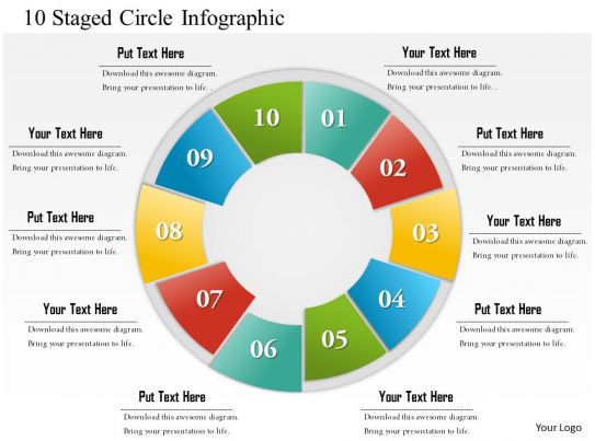
Link to the Image
You can find the link here. All credit goes to slideteam.net for the image. Thank you guys!
