We’ve all sat through presentations that we found, for lack of a better term, horrible. But sometimes, we encounter presentations that are so bad, so disgusting, so monumentally horrific, that we have to sit back and appreciate just how awful they are. I’m going to cover some of these of these presentations in this post, and yes, do expect a laugh or two. More importantly, these eyesores also give a strong indication of everything you should NOT do the next time you create your PowerPoint slides. So, let’s laugh and learn.
1. This Awful “Summary”

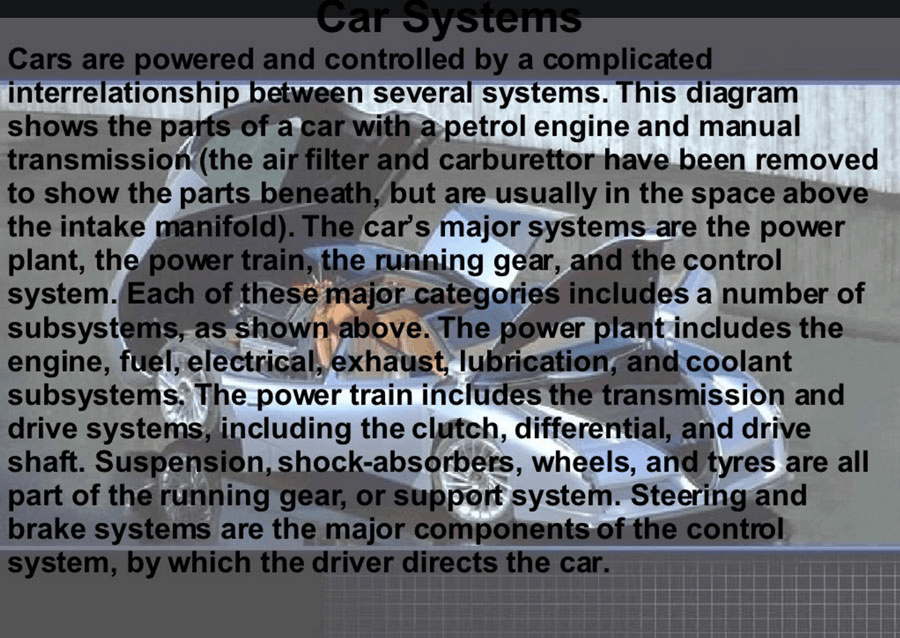
Where do I even begin with this?
The whole idea of a summary is to give a brief statement of the main points in regards to something. The key word here, obviously, is ‘brief.’ So imagine my surprise when I see a wall of text so large it would probably take the rest of my life to go through all the important points. I can’t overstate just how huge this text box is. I mean, look at it! It’s so big it goes over the illustration at the bottom left corner!
Nobody is going to sit there and read that. I wouldn’t even do it if you paid me. Presenters are better off using icons to illustrate the main points, and maybe add a few text boxes to get the message across; check out Slide Cow’s icons guide here to know how to do just that.
2. This Terrible Graph Spam

I used this picture to illustrate why technical people suck at PowerPoint. I guess the point still holds merit if people think it’s a good idea to make a slide that looks like this.
Graphs and charts are a norm in presentations. If anything, they tend to presentations sexy since people are always looking to find ways to visualize data. But trust me on this, you don’t need 100 graphs on the same slide. Yeah, I counted.
Presenters are better off using a more systematic approach to beautifully visualize data like the one I outlined in a separate post. A process like the one I described will at the very least safeguard people from making horrible PowerPoint slides like this.
Also, I can’t help but notice that the title takes up a quarter of the slide. I mean for God’s sake. Come on.
3. This Disgusting Hairball

Really?
Somebody actually thought it would be a good idea to present something like this?
REALLY?
When I saw this slide, I was motivated to do a little research to find out what the purpose of its existence is. Not surprisingly, I didn’t get very far. All I understood was that this slide was presented to Gen. Stanley A. McChrystal and it had something to do with some strategy (perhaps military strategy?) in Afghanistan.
Gen. McChrystal, I salute you for even having the audacity to process whatever this slide is.
Honestly, anyone is better off doing anything else that isn’t this. That includes putting a face on a keyboard and rolling it.
4. This Horrible Merry-Go-Round
What the hell even is this?
It’s so terrible I can’t even come up with a witty remark about it. Look at it! Arrows are flying everywhere like doves from a John Woo movie (oh, wait, I guess I can).
Even if I gave this slide the benefit of the doubt and put the use of arrows aside, I can’t get over the horrible use of the text; it’s just plastered everywhere! What makes it worse is that the different text boxes are rotated too.
For slides like this, stick to making easy-to-process infographics that are designed to get one’s point across. Slide Cow has tons of infographic tutorials; in fact, the last PowerPoint tutorial I covered gave an excellent example of how to make a funnel infographic that doesn’t look like crap.
Whatever you choose to do, just make sure it isn’t whatever this is.
5. These Atrocious Uses of Images

HAHAHAHAHAH.
Okay, okay I’m done.
If one wants a decent front cover, then one must learn to make one. Here’s a tutorial where I covered how to make a beautiful front cover from scratch.
Oh, you thought we were done with this part of the post? You thought wrong. Here’s another slide from the same presentation.
Come on. Is it too much to ask to get a decent title and block of text on a slide without choosing horrible effects that a 5-year-old would go for?
If presenters want to have an image as a background, then they should at least learn how to do it right. This tutorial over here is a good example of how background images can complement the text on the slide.
6. This Brutal Word Art Avalanche
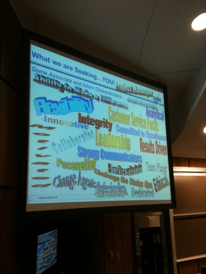
This one’s my all-time favorite.
When I was a kid, I always thought that Word Art was the bee’s knees to every Microsoft Office file out there. Come to think of it, I pretty much used all the Word Art styles available on my .doc and .ppt files. But I would have never, ever, not for a second, thought that using them all on the same slide (or page) would be a good idea.
It’s as if the person who made this slide went out of his/her way to exhaust every Word Art avenue there was and make something that could make eyes bleed. If that was the intent, then mission accomplished.
Seriously though, don’t do this. Here’s a better tutorial that highlights how to add little creative flair to text the right way.
Let me show you how to be amazing
If you’re looking for a way to make fantastic PowerPoint slides in a matter of seconds, then I urge you to check out the Slide Cow Toolkit. You can’t go wrong with over 120 pre-made, editable, multipurpose PowerPoint slides, 700 editable icons and 5 hours and 40 minutes of video guide content that teach you how to make jaw-droppingly good presentation slides. The value of this one package is pretty incredible, and will, without doubt, toss the ideas of making horrible slides like the ones you just saw in the garbage.
Save the world from terrible presentations
There are two things that you need to do right now.
First, share this article with everybody and anybody that either gives presentations or uses PowerPoint regularly. Post it on your social media, email it to your colleagues at work; I don’t care. The whole idea of this post is to stop terrible slides from ever coming to the surface again.
Second, drop me a line in the comments below and tell me the single worst experience you had when it came to a horribly designed presentation. How did you feel? Were any steps taken to remedy the awfulness?
