You probably already know adding illustrations to your presentation content is a great way to communicate your message in a way that is fast, easy and effective. This especially makes sense when data comes into play. After all, data is just a bunch of facts or statistics that are collected together for reference and analysis. So, when you’re designing slides, it’s imperative you find a way to communicate data that makes it easy for your audience to both recognize and process.
Think about it. Would you interpret a table full of meaningless numbers, or a chart that illustrates those numbers in a way that allows you to spot critical patterns and trends instead? I don’t know about you, but I value my time. I don’t want to look at a slide and play Where’s Waldo for five minutes when I already know there’s a better way.
Will that said, there’s a nuance that I see happening almost every day. Too many people take data visualization for granted and almost always opt for the bare minimum approach. The average presenter will load up the numbers on the slide, highlight them, then click Insert: Pie Chart and call it a day. This drives me insane. Why wouldn’t people take a few minutes to look at their slides and ask themselves, “Would my audience get what I’m trying to communicate here?” or, “Have I done enough to add value to the message?” This is kind of why I made a point that technical people suck at PowerPoint.
Data visualization isn’t just the process of slapping on a few charts. It’s about putting in the effort to help your audience understand the significance of the data that is being presented. What we’re trying to do here is to look for ways to make the data easier to comprehend. Doing so will make statistical relationships, patterns, and key trends become more exposed and recognized.
And that’s where I come in! I’m going to help you with your data visualization techniques through a simple four-step guide. I’m going to be using the data derived from the first image in this post (the table with the stupid amount of data points). This way, you’ll see my thinking process put into practice and get a better sense of what I’m talking about.
Step 1: Tell the right story
Your data tells a story, and it’s your job to find a particular story that will fit the audience’s requirements. To do this, you need to ask yourself three questions:
- “What is the purpose of visualizing my data?”
- “Who am I trying to communicate this purpose to?”
- “How am I going to visualize this purpose in the best way possible?”
Once you’ve answered the what-who-how combo, you’ll notice the message you want to communicate starting to shape into something more valuable.
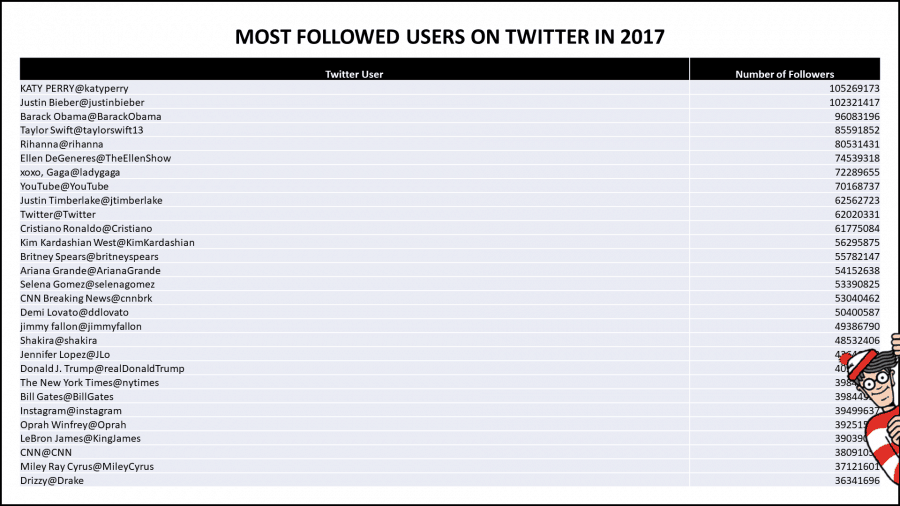
Let’s put this method into practice. Refer back to the first image in this post. I have a list of the 50 most followed users on Twitter in 2017 and their follower counts.
- “What is the purpose of visualizing my data?”
The story I want to tell is that Katy Perry is the most popular personality on Twitter in 2017, but isn’t too far ahead of Justin Bieber. - “Who am I trying to communicate this purpose to?”
An audience that has a decent knowledge of social media platforms, and is curious about the level of influence people have on Twitter - “How am I going to visualize this purpose in the best way possible?”
The best way to do this is to either use a bar chart or a column chart. This way, my audience can quickly identify the variances between each person listed in the chart.
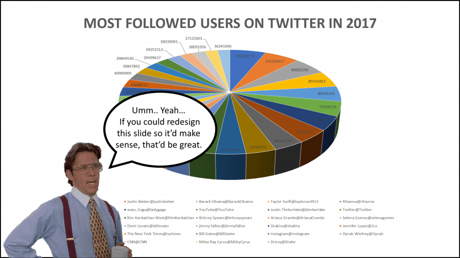
Now, let’s see how this looks like.
Okay, I’ll be the first one to admit it. This doesn’t look too great right now. But don’t worry, that’s what the other steps are for.
Step 2: Add less, not more
A common pitfall I see is the average presenter wanting to show off everything and anything. As such, this presenter will pack in every single data point into one slide.
Oh, but it gets worse.
The said presenter usually has no regard for the message; instead, he/she thinks it’s acceptable to blow everything off and let the audience figure it out.
Don’t do this.
Your presentation is not about you, nor is it about what you did. It’s about making sure your audience has a path to receive your message as clearly and concisely as possible. So unless you want to set yourself up for a presentation full of yawns and audience members too busy looking at cat videos on the internet, then do not jam-pack all your data points into your slide(s).
You do not need to include everything. You only need to add the data points that are in line with the purpose of your message.
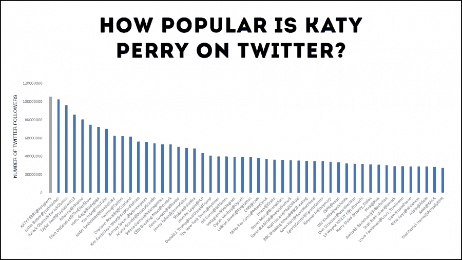
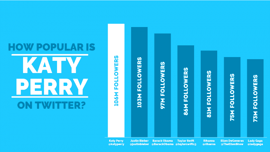
Let’s put this into practice. In the first step, I found out that the best way to illustrate the purpose of my message is through a bar chart. As you and I can both see, there are way too many variables. I don’t need 50 data points to convey the purpose of the message. I’ll keep things simple by only illustrating seven.
I’ve also noticed that there’s no need for me to have any labels on the Y-axis. I’m better off adding data labels so that the audience doesn’t take time matching the column to the number.
Finally, I think it’s a good idea to make the columns thicker. This is just to interpret the chart as simple as possible.
Here’s our result.

This looks better, but we still have a lot of work to do. Onto the next step!
Step 3 Add flair that is relevant
This is the most fun step of them all because now you’re going to be an artist! The aim here is to try and add visual creativity to add further purpose to your message. You only want to add creative elements that help provide context for what you’re trying to communicate. Do not add anything to your slide that distorts, or adds ambiguity to your message.
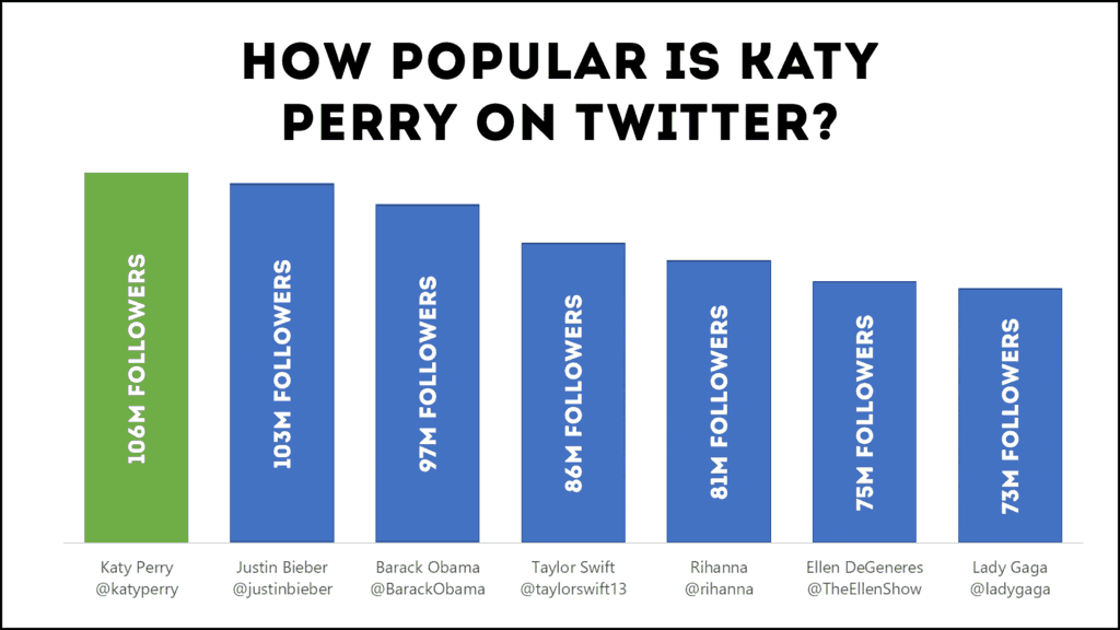
I understand that this can be a little complicated, so let’s use our Katy-Perry-fueled-Twitter slide to show you what I’m talking about.
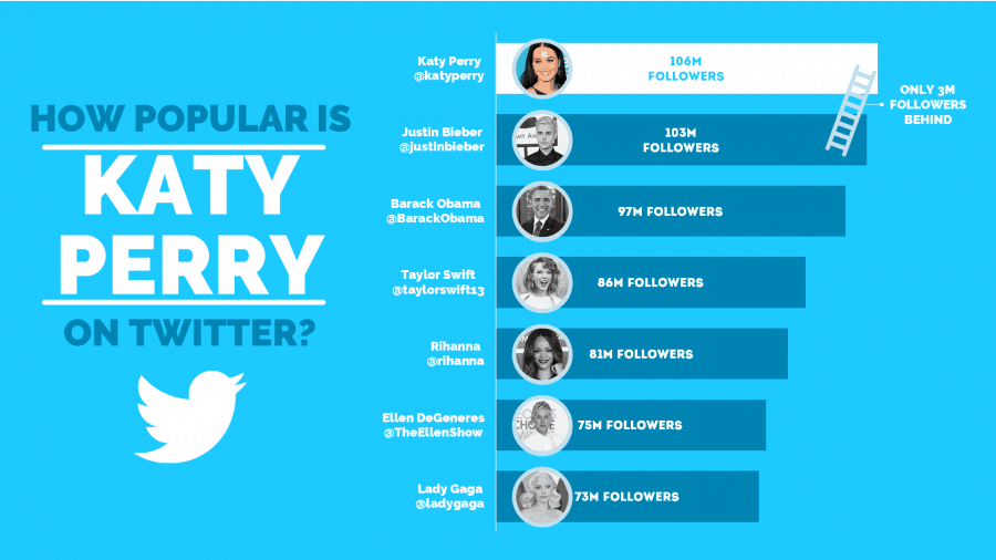
After looking at my purpose again, I noticed that there are two key takeaways from the statement. The first takeaway is that this slide is based on Twitter, so I want to redesign the slide using Twitter’s color palette. The second takeaway is that Katy Perry is the dominant figure Twitter personality, so I want to make sure that the Katy Perry’s data point is isolated from the crowd. Let’s see what we have now.
I think that looks great! The flare I added allows my audience to immediately recognize that Katy Perry’s popularity on Twitter’s platform is the basis of the discussion, so it’s relevant.
We can still do more though, so let’s jump to the final step.
Step 4: Add creative details to your data
I’ll be honest; the fourth step is only for those who want to go the extra mile and aim to bring in every bit of value to the message. What you want to do here is review your slide and compare it to the three answers you provided in the first step. You want to look for ways you can bring in that little extra edge to make sure your message is received and processed effortlessly. In layman’s terms, search for your wow-factor.
In my example, I noticed that there are a few things we can do.
First, I noticed that more could be done to associate the slide with the Twitter platform. It’d be a good idea to add the Twitter logo to the slide, just underneath the heading to get a good tie-up between the text and the image.
Second, I realized that my chart looks a little bunched up to the side. I figured it would be better if we changed it from a column chart to a bar chart. That way, I’ll have more space to play around with if I need to.
Third, the data looks a little dry. I figured adding a few pictures to represent the Twitter personalities visually would do wonders.
Finally, I added a ladder icon between the bars representing Katy Perry’s follower count and Justin Bieber’s. After all, my purpose was to highlight that although Katy Perry is winning the race, the Canadian superstar isn’t too far behind. To seal the deal, I added a few words highlighting just how far behind the Biebster is.
Let’s look at the result.
You know that feeling of satisfaction when you finish something great? That little sigh of relief followed by that lean back into your chair? All of this with a grin you can’t wipe off your face? That’s precisely I how I felt when I finished this slide, and that’s how you should feel too!
In Closing
Going the extra mile with data visualization techniques is what separates the veterans from the rookies. By following this 4-step guide, I’m pretty damn confident that you’ll exponentially increase the effectiveness of your presentations. After all, what we’re after is creating a slide that your presentation audience wants to engage with.
I’m here to help
I know it can be tedious to get a sense of “good” design, especially when it comes to dry facts and numbers. This is precisely why I created the Slide Cow Toolkit just for you. You’ll have access to over 120 slides and over 700 icons for you to play around with to make stellar slides. Oh, and the tip of the iceberg? You’ll learn how to do it with over 5 hours and 40 minutes of video guide content. Do yourself a favor, invest in your education and get the Slide Cow Toolkit by clicking here.
What would you do with your data?
Would you follow these four steps to a T? Maybe skip a step? Perhaps add a step? Or maybe you witnessed a presentation that sucked so bad you almost fell into a deep coma because there was just too much data to process? Just let me know in the comments below.
Note: this blog post was featured on Ellen Finkelstein’s blog. She was kind enough to let me publish a guest post. There’s some great content on there. You should check her stuff out!

Awesome information, Yoyo. This blog is turning out to be an amazing PowerPoint mastering course. Thanks so much for sharing your knowledge and your process so we can maybe become as great as you!
You’re very welcome, Ursula!