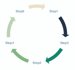
So I’ve been getting tons of e-mails lately asking me how to make a cycle infographic. I love you guys, so I’m going to do exactly that. I will show you exactly what to do to make a cycle infographic that is functional and aesthetically pleasing.
How is this different from a process map or timeline?
Process maps and timelines usually have a unique start and end. With a cycle, the end and start point are usually the same. This, obviously, indicates that the process can be repeated.
Ok, but why is this important on PowerPoint
I know, for a fact, you have seen tons and tons of cycles on different PowerPoint slides. The problem, of course, is that they tend to look kind of bland. I mean, just take a look at the one below:

The goal here is to create something engaging. Something that your audience wants to follow, instead of being obligated to follow. We’re going to create a slide that allows your audience to easily identify the steps needed, and interpret the information associated to the step in particular. Just remember, simplicity is key with all of Slide Cow’s tutorials!
So what are we going to learn in today’s video?
I’m glad you asked. In this video, you will learn how to:
- Create arrows using shapes and the merge shape option(s) on PowerPoint.
- Use colors to create a “folding effect” for our arrows on PowerPoint
- Use effective font choices, colors, and icons to allow for easy association for our information.
- Position elements perfectly with ease on PowerPoint using the arrange options..
- Take advantage of white space within our PowerPoint slide so that it is clear and concise.
I’ll see you guys in the next one! Be safe!
Edit: it has come to my attention that I can’t count (woops). Please do be aware that the above sequence is 1 > 2 > 4 > 3 where it should instead be 1 > 2 > 3 > 4. Still, a minor error won’t stop a great design. Happy PowerPoint-ing!