Hello PowerPoint Samurais! This week’s tutorial is going to focus on bringing more attention to your information on your PowerPoint slide; and we are going to do that by creating arrow infographics. Not just any arrow infographics, mind you, but arrow infographics with a cool 3D effect (woop!)
Why arrows though?
Arrows on PowerPoint slides do two things. They give a sense of direction (i.e. where to look) and they bring emphasis to things the arrow is pointing to (i.e. what to look for). By making an infographic made up of arrows, we are allowing our audience to process the key takeaways of your slide in seconds. That’s pretty much the goal here.
Did I also mention they look cool?
How does this slide work?
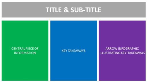
Check out the picture above. There are three boxes that we are concerned with.
- The central piece of information (left): this is the information you want to convey to your audience in full. In most cases, this will be your analysis or your summary, or whatever
- Key takeaways (middle): this is the place where the key points of your information will be listed. The key points are derived from your central piece of information.
- Arrow Infographic (right): this is the area that will illustrate your key points. We will be using a combination of colors, icons, and infographics to allow your audience to focus on whatever needs to be focused, at their own pace.
The whole PowerPoint slide comes together very nicely, where each of these components feed into adjacent components.
What are we going to learn in today’s video?
In this video, you’re going to learn:
- How to create arrow infographics with 3D effects on PowerPoint
- Use whitespace effectively on Powerpoint
- Correlate visuals to data to text on Powerpoint
- Emphasize on key data points on Powerpoint
- Use colors, icons, and fonts to your advantage to make your data look super appealing!
And much more!
Have fun with this one!
