I’ve come to believe that icons are not just a convenience, but a requirement in strategic communication. We see them everyday, and for good reason too. Icons support us in interpreting and understanding information that we want to interpret and understand.
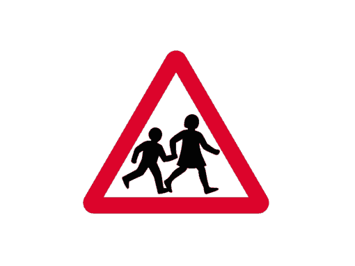
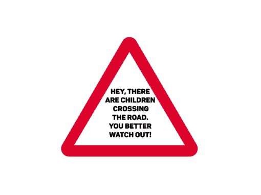
Sounds complicated? Not really. Here, I’ll show you. Which of the below would you like to see when you’re driving on the road?
what is an icon, really?
Icons are graphic symbols that represent a specific piece of information, motive, action or brand.
Ok, so what do icons have to do with PowerPoint?
Some time ago, Slide Cow made a video highlighting three ways to bring beautiful and customizable icons on our PowerPoint slides. In that video, I made the following statement:
“The use of icons is what separates good PowerPoint slides from bad PowerPoint slides, period.”
The reason why is actually quite simple. PowerPoint is a communication tool, and as such, we are supposed to be taking advantage of that tool in a way that makes it easy for our audience to understand and interpret our information. Icons in our PowerPoint slides do just that. They draw attention to, categorize and simplify the information on our slide.
Let’s examine each point in detail.
Icons categorize and simplify the information on your PowerPoint slide.
Go back to the moment you were asked (or, really, you were required) to attend a meeting or classroom event that involved somebody making a presentation. Of course, the speaker of the presentation walks up, introduces himself/herself and the topic, and sets the tone. The speaker reaches out to press the ‘next button’ to see the first slide. And then, it hits you.
BOOM.
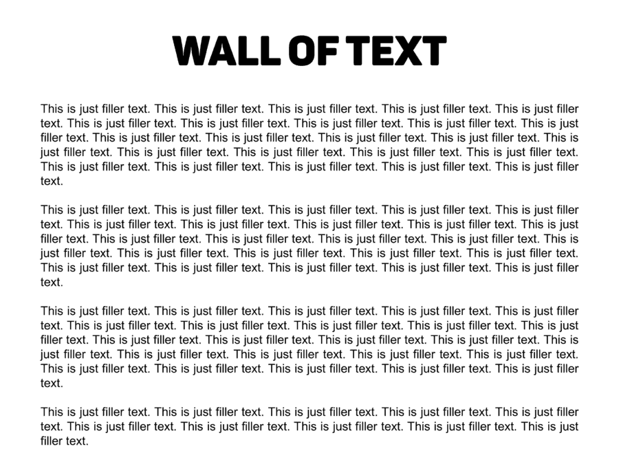
Huge wall of text. Every single word surrounds you, daunts you, makes you want to yawn… to death.
(Can you tell I enjoy making things dramatic?)
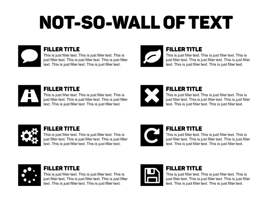
Now imagine the speaker took the time to add some icons to the slide. Icons could go a long way in easing the audience’s ability to interpret your slide. In fact, by simply adding icons that are associated to your content, we are doing two things:
- We are segmenting and categorizing the information into smaller chunks of information.
- We are essentially making it easier for your audience to read, interpret and absorb the information presented.
In essence, our audience will consume each segment on our PowerPoint slide, piece by piece. This is exactly what we want, because we are following our audience’s pace, and they are not forced to follow ours.
Icons draw attention to the content on your slide.
Go back to the time you last bought something online and really think about how you bought that item.
Don’t think about the item, think about the process you went through to pay for it.
How did your eyes know exactly what to look for? It’s like your mind said “don’t worry, I’ll be sure to get your iPhone case shipped to you in no time.”
Was it really just a coincidence?
Nah. It really isn’t.
The truth is you were looking for the right image queues to buy your item. What’s more: the majority of the time, these image queues are actually icons.
Don’t believe me? Check out Amazon.
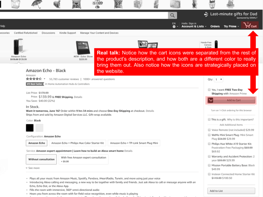
It’s really the exact same thing with PowerPoint.
If strategically placed, icons will in fact draw our audience’s attention to the content. What’s better, is that our audience will then be able to bridge the gap between the icon and the information associated to it.
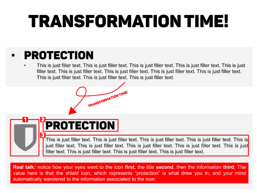
It’s almost as if the icons were the ‘hooks’ to the content on the PowerPoint slide.
Be wary of which icons you use
So, the importance of using icons have been established. Awesome! Now it’s time for you to follow me into the dark side while I whisper these words in your ear.
Don’t use the wrong ones.
See, when we use the wrong icons, that cause major implications and can completely affect our PowerPoint slide. Our audience won’t be able to interpret the information efficiently, make the correct associations, or even navigate through the different pieces of information on our PowerPoint slide.
So, let’s be sure to do our research and use the right ones.
CONCLUSION
Just because icons are small graphics on a big canvas do not make them redundant. Quite the contrary, they play a vital role in PowerPoint design. They grab attention and support the audience in interpreting our PowerPoint slides.
Let’s just be sure to use the right ones by doing the right research.
Don’t worry, I’ll teach you how to do that in the future.

Great info! I´ll be looking forward to the follow-up article on how to find the right icons. I think that’s going to be huge. Sometimes it’s difficult to find what the right icon can be. Especially if you’re making a presentation for a client, and don’t have a lot of time to research the information in the presentation.
Thanks, Yoyo!
Very informative (and entertaining, which is always a bonus). Looking forward to learn more on how to pick the most effective icons. They are a small but powerful tool to elevate slides and make information more “digestible”. Thanks a lot for the great content!
Absolutely, Ursula!