Bullet points suck. I feel that they’re the plague of the presentation world, except nobody is doing anything to fight back. In fact, bullet points and numbered lists have become such a norm in the presentation world that people think it’s okay to use them for everything.
Read this carefully: it’s NOT okay.
Bullet Points Are Bad Because Science Says So
Some time in 2014, the International Journal of Business Communication (IIBC) conducted a study in an attempt to gather evidence on the use visualizations in business communications. The good people behind IIBC wanted to find out if the use of visualizations are, for the lack of a better term, “better” than just using plain old text.
The results won’t surprise you.
IIBC confirmed that lists of text suck, plain and simple. The journal states visuals are the way to go. In fact, here’s a specific quote from the study itself:
“Subjects who were exposed to a graphic representation of the strategy paid significantly more attention to, agreed more with, and better recalled the strategy than did subjects who saw a (textually identical) bulleted list version.”
Like I said, no surprises here. Whenever a slide is full of lists of text or numbered items, the audience won’t pay much attention to the message being communicated, let alone process it. Think about it – go back to a time when you were witnessing a presentation that was slathered in bullet points. Do you remember anything at all?
Chances are you don’t.
What You Should Be Doing Instead
So we’ve established that bullet points should be avoided at all costs. Great. Now what?
The go-to strategy is to stick to two golden rules: less is more, and visuals are everything.
Less Is More

As I’ve outlined in a separate post, you have to be willing to cut information that is redundant, low-value, or even baseless. Only keep all the vital stuff in there (and before you say it, no, not everything you have on your slide is vital).
The goal is to be left with something a little more easier to process.
Visuals Are Everything
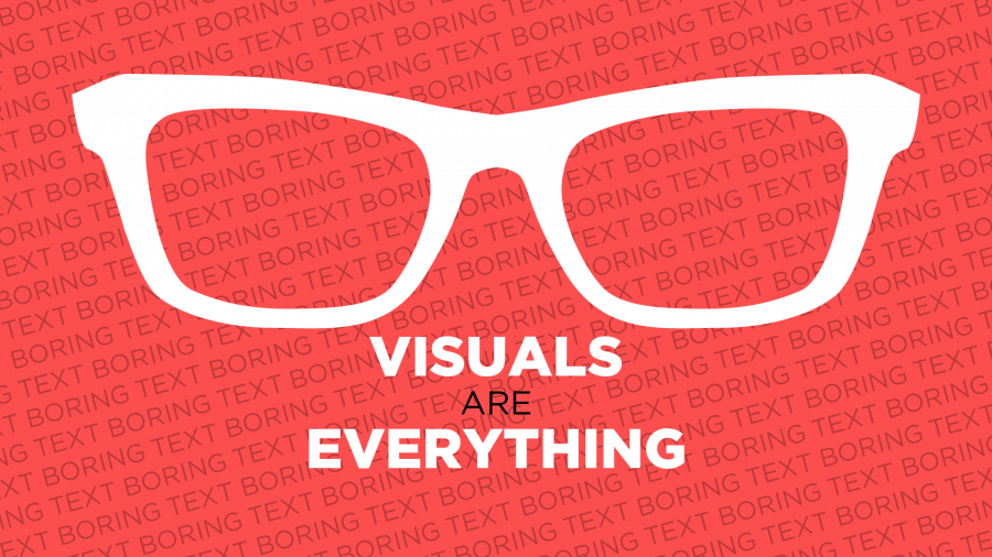
Even when I die and am buried six feet under, I will find a way to vouch for the use of visuals in presentation slides beyond the grave. In fact, the whole idea of making Slide Cow is to encourage you to use visuals whenever you can. Take note, though – I’m not talking about throwing in some PowerPoint clip art and calling it day. I genuinely mean that you should be using visuals to add value to your message. The visuals have to be both meaningful and visually appealing.
Don’t know where to start? Let me help you. Here’s a list of the three most effective ways of using visuals.
Use Icons
![]()
Icons are visual representations of what you want to communicate. Therefore, it only makes sense you use them whenever you can. With icons, your audience will have the ability to easily interpret and categorize the information presented, simply because they add value to your text.
If you don’t know how to bring in icons into your PowerPoint slides, then check out this tutorial that I have outlined here. It has everything that you need to know.
Use pictures

I want to be clear here: this is not the easy-way-out. You can’t just slap a few pictures onto your slide and call it a day. What you should be doing is focusing on the pictures that add value to your message. You know the ones that I’m talking about – the ones that make your message that much clearer and concise. If you have no idea how to do that, then here’s a simple image check list that you can use for all your images.
Use Infographics

By definition, an infographic is a visual representation of your data (or information). If you’re a regular here, you’d know that I am BIG on the use of infographics. Hell, most of my tutorials are infographic tutorials. Here’s one that I did just last week that you might want to check out.
The bottom line
There’s really nothing much more to say here. Stop using bullet points and start using creative techniques that appeal to your audience. Yes, this will probably mean that you’ll have to work just a little bit more, but think about your goal. You want to make sure your message gets across and holds the capacity of being retained.
So get to work.

I can’t find the study you mention. You don’t actually cite the source.
The key problem with bullets is that people overuse them. As you say, they’ve become the norm.
If a presenter overuses any type of slide – even ones based on icons or pictures – that can be a problem too. (Sure, it’s not as much of a problem, because few presenters do that, so audiences aren’t as sick of icons or pictures. Still, I’ve seen presentations where the speaker was bullet-phobic, so used cartoon graphics on around 100% of the slides, and the effect was almost as mesmeric as if they’d all been bullet-based.)
So I’d say the best solution’s to vary the types of slides in a deck. Use icons, photos, charts, quotes, short video clips (preferably <1 min), stories where you black out the slide – you name it.
Have you seen Nolan Haims' video on this topic? He's a PPT MVP, and he uses Morph transitions to show how you can transform bullets into something else (or even just improve the bullets, as a first step).