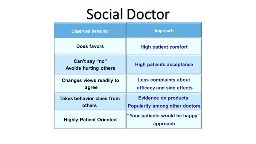
I love a good challenge, and this one is probably the best one I’ve come across to date. We’re going to transform a Slide Cow subscriber’s text-heavy, medically-themed PowerPoint slide into something epic.
The request
This week’s request came from Sanjay. His email is below.
Hi Yoyo,
I [learned] a lot from your tutorials and created few good slides myself.
[I] just wanted your help for this slide which is a bit boring and text heavy. It’s [about] profiles of a customer and how to approach the customer.
Regards,
Sanjay
The results
First thing to note, I’m automatically assuming that the slide Sanjay sent me did not contain confidential information. Like I always say, if it’s confidential, then please do not ask me to redesign it. These tutorials are public, after all.
As I mentioned earlier, this slide was particularly challenging to redesign. I spent days making a working a draft because nothing ‘clicked.’ It wasn’t until I was watching some hospital-themed soap opera (don’t judge me, my wife made me watch it) that I came up with an idea.
See, the logo of the hospital in the soap was a heart with a heartbeat in it. It was truly a eureka moment, and it just goes to show that you can draw inspiration from anything. Even shitty soaps, apparently.
The results are great. Check them out below. You can find his slide on the left, and my makeover on the right. Be sure to move the slider to the left or the right get a better view of the slide.


What I did and why I did it
Because I truly hate PowerPoint’s default heart shape, the first thing I did was look for a heart icon that wasn’t shit. My aim was to find something bold, but curvy, and I found that over here. It’s an icon I found on the Noun Project, designed by Lloyd Humphreys.
And hey, if you’re wondering how to bring in icons that are completely editable into your PowerPoint slides then you should check out this post here.
Next thing I did was design a heartbeat illustration to be placed inside the heart itself. I did this using PowerPoint’s rounded rectangle shape. It was pretty easy to do. Once I got the illustration I was after, I placed the heart in the middle of the slide to leave some whitespace on the left and right. Obviously, the whitespace was filled with Sanjay’s categories and text.
When I was done, I still thought there was something I could do to really make the slide scream “I’m different!”
So, I rotated it.
Yep.
Just rotated it.
Is this easy to do?
All my tutorials are easy, just follow what I do in the video guide.
What the PowerPoint tutorial covers
The video will teach you how to:
- Design a heart and heartbeat illustration using editable icons and PowerPoint shapes.
- Play with gradients to really bring out the colors on the PowerPoint slide.
- Rotate elements in the PowerPoint slide to create perspective.
- Further reinforce the theme of the slide with appropriate fonts, colors, text, and positioning.
- Take advantage of white space within our PowerPoint slide so that it is clear and concise through key positioning.
Superb job done Yoyo, as always. Thanks so much. It has come out really well. God bless your creativity
Any time Sanjay! Glad you enjoyed it!