If you’re presenting at a major event like a business conference, it’s imperative that you have a slide that introduces the key topics that will be covered throughout the day. Think of it as an icebreaker for your audience; you’re easing them into the concept of covering multiple components depending on what time it is. Of course, this slide I am referring to is the agenda slide.
THE REQUEST
I got an email from Melanie last week, and it reads:
Hey Yoyo,
First of all: Thanks for your constant support and being an inspiration for all of us! I really appreciate that you put so much time and love in this side project of yours.
Even though your videos help me a lot I am sometimes still struggling with some different tasks.
Right now I am preparing some template slides for a conference, where I have to display the daily agenda or a timetable.
I came up with a more creative approach for it, but I think there is still something missing, and I need the little Wow effect to make them stand out.
I have attached my design below, maybe you can give it a try!
Thanks in advance,
Melanie K.
So, a wow effect is what Melanie is after, and a wow effect she will get!
I looked over Melanie’s agenda slide, and to be honest, it was pretty good. In fact, it was a proud moment for me. She followed Slide Cow’s principles and made something different than the modern-day bullet-point list. Hell, she even themed it into a Slide Cow style presentation!
After trying to figure out what she was missing, the answer was pretty obvious.
Icons.
If you’ve been on this website long enough, you’d know that I love icons and everything to do with them. After all, they’re pretty damn important since they can establish clear communication protocols with the presentation audience.
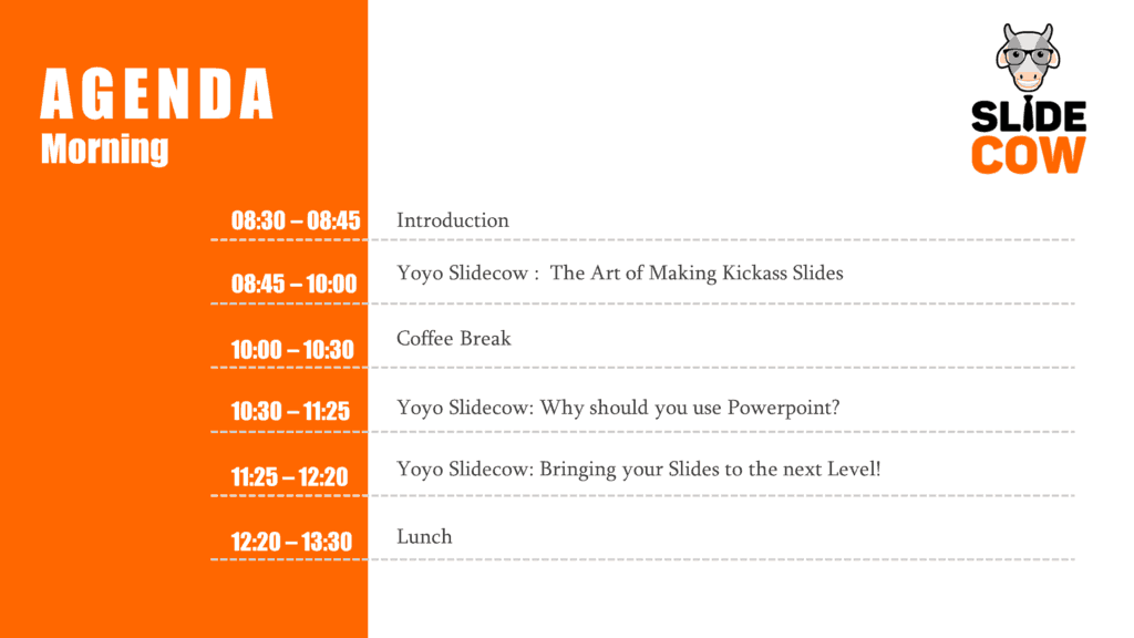
Here’s the redesign, you can find her slide on the left, and the Slide Cow makeover on the right. Be sure to move the slider to the left or the right get a better view of the slide.

WHAT I DID AND WHY I DID IT
I didn’t want to drift too far away from Melanie’s original concept because it was very good.
Although the concept remained intact, I did make a dramatic change to the layout only because I felt that we could improve on the white space and the overall spacing of elements on the PowerPoint slide. I, therefore, switched the slide’s “Agenda” heading from the left corner all the way to left, making it read vertically.
I then listed a few circles down a line that gave the impression that everyone was interconnected (which, of course, is true).
Finally, I played around with the font, sizing, and colors to replace her concept to making a list of agenda items going downward.
IS THIS EASY TO DO?
Yes, probably one of the easiest tutorials out there.
WHAT DOES THE POWERPOINT TUTORIAL COVER?
This PowerPoint tutorial will teach us how to:
- Create a stunning agenda slide using nothing more than shapes, colors, and icons on PowerPoint.
- Further reinforce the theme of the slide with appropriate fonts, colors, text, and positioning.
- Take advantage of white space within our PowerPoint slide so that it is clear and concise through key positioning.
I DON’T KNOW HOW TO BRING ICONS INTO MY POWERPOINT SLIDE
Never fear, I got you covered. See: How to Important (or Even Make) Icons to Make Your PowerPoint Slides Look Awesome.

Your are awesome….thank you!
No, you’re awesome, and thank you!
Can you please share the slide you created in this video? I love it!!!
Wow! So many tips paced into one video. Great speed of your presentation – didn’t have to speed you up like so many others. Great teacher.