Last week’s post (which you can check out over here) was a huge hit – people loved to see Slide Cow taking people’s slides and completely re-designing them. So, this week, we’re going to follow that trend. We’re going to make a Slide Cow follower’s quote slide a-moo-zing!
The Quote Slide in Question
Here’s the email request I got from a great Slide Cow fan:
Dear Yoyo,
I loved your last ’design a good slide’ tutorial where you helped out Jen. I was wondering if you could do the same for me.
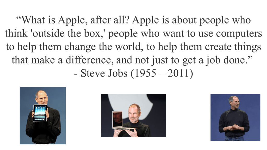
I’m a student in college, and I have a presentation where I have to present about steve jobs during his time as CEO of apple.
I have this one slide of a quote by him. I think it looks really boring.
Can you help me make this slide look a-moo-zing? I promise I’ll tell all my friends about you if you do!
Thanks,
Sandeep P.
A quote slide is an interesting choice. It’s a good way to add more emphasis or credibility to the key points in your PowerPoint deck, so I applaud Sandeep’s decision in bringing something relevant to the content of his presentation. Way to go, buddy!
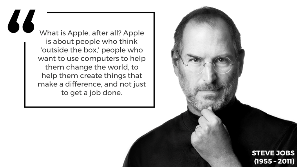
I took Sandeep’s PowerPoint slide and redesigned it. I wanted something minimal, but effective. I also wanted to evoke elements of emotion, so that the slide ‘speaks to the audience’ (I know, I know, cliché).
You can check out the before after below. Be sure to move the slider accordingly to get a better view.
What I did and why I Did It
Sandeep did the right thing by including images of Steve Jobs. However, there were a few areas that could be improved on.
First, there’s no need to add more than one image of Steve Jobs. Too many pictures of the same subject matter make your slide look cheesy. You only need just one, big, ‘good’ image to make your PowerPoint slide thrive. Second, the choice of images could have been a bit better. So I chose one image of Steve Jobs that looked personal. It’s as if Steve Jobs is looking directly into your eyes as you’re reading the quote.
You might be asking why and how I feel that this image of Steve Jobs as the best image? Simple. I used the BARE checklist, which I outlined in this post over here.
I also wanted to add a design component to the quote itself. I made a box and stuck a quote icon on the top left to indicate that this was a quote. I also changed the font and its size to focus more attention suit the overall theme of the slide. The result looks pretty sleek, don’t you think?
Is this easy to do?
It’s straightforward to do, and the results are pretty effective.
What does this PowerPoint tutorial cover?
This PowerPoint tutorial will teach us how to:
- Turn a quote PowerPoint slide from boring to beautiful based on sound design and communication principles.
- Effectively utilize a high-quality stock photo as the background of our PowerPoint slide (I have listed four websites that you can use to find high-quality stock photos for free over here).
- Make a quote box using a combination of shapes and PowerPoint’s Merge Shapes feature(s).
- Make a quote icon using a combination of text and PowerPoint’s Merge Shapes feature(s).
- Take advantage of white space within our PowerPoint slide so that it is clear and concise through key positioning.
